Predicting early onset dementia

First things first, the code for this series can be found here.
If you prefer to see the contents of the Jupyter notebook, then click here.
Dementia is a progressive brain disorder that affects an individual’s memory, thinking, behavior, and ability to perform daily activities.
It is a broad term used to describe a decline in cognitive function that is severe enough to interfere with one’s daily life.
Dementia can take many forms, the most common cause being Alzheimer’s disease.
There is currently no cure for dementia 😔 , but early diagnosis, proper care and support from family & friends can help individuals affected by this condition to maintain their quality of life.
On the back of losing a loved one to Alzheimer’s, I was motivated to investigate if it was possible to:
Use a machine learning approach to try and identify the early symptoms of Dementia using
kdb+
This was in the hope that such a diagnosis will:
-
help manage a patient’s treatment and care
-
improve the quality of life through each stage of the disease for both the patient and family member.
The Dataset⌗
This project uses cross-sectional and longitudinal data from the OASIS brain project. What does that mean?
💭 ELI5
We will use a dataset, that contains the below features, to train machine learning models to predict a Clinical Demential Rating (
CDR).The
CDRis a global rating scale for staging patients with dementia.It is based on a scale of 0-3:
- no dementia (
0)- questionable dementia (
0.5) …- severe cognitive impairment (
3)Note, since these datasets have been provided by the
Open Access Series of Imaging Studies (OASIS), a project that provides freely available neuroimaging datasets to the public, we must acknowledge them:
OASIS-1: Cross-Sectional: Principal Investigators: D. Marcus, R, Buckner, J, Csernansky J. Morris; P50 AG05681, P01 AG03991, P01 AG026276, R01 AG021910, P20 MH071616, U24 RR021382
OASIS-2: Longitudinal: Principal Investigators: D. Marcus, R, Buckner, J. Csernansky, J. Morris; P50 AG05681, P01 AG03991, P01 AG026276, R01 AG021910, P20 MH071616, U24 RR021382
Loading in the dataset 🚀⌗
As the data is stored in a CSV file, the kdb+ method 0: is wrapped in a custom function loadCSV to read the MRI data into memory.
A boolean (1b) is passed as a function parameter to enforce camelCase convention on the column headers:
q)5#data:loadCSV[`oasis_longitudinal_demographics.csv;"**SJJSSJJJJFFFF";1b]
subjectId   mriId           group       visit mrDelay mF hand age educ ses mmse cdr etiv     nwbv  asf
--------------------------------------------------------------------------------------------------------
"OAS2_0001" "OAS2_0001_MR1" Nondemented 1     0       M  R    87  14   2   27   0   1986.55  0.696 0.883
"OAS2_0001" "OAS2_0001_MR2" Nondemented 2     457     M  R    88  14   2   30   0   2004.48  0.681 0.876
"OAS2_0002" "OAS2_0002_MR1" Demented    1     0       M  R    75  12       23   0.5 1678.29  0.736 1.046
"OAS2_0002" "OAS2_0002_MR2" Demented    2     560     M  R    76  12       28   0.5 1737.62  0.713 1.01
"OAS2_0002" "OAS2_0002_MR3" Demented    3     1895    M  R    80  12       22   0.5 1697.911 0.701 1.034
...
From eye-balling the table above, one will notice that the column header group conflicts with its reserved namesake function in the .q namespace
In normal circumstances, the internal .Q.id function is built for dealing with these cases - it will append a 1 to headers that conflict with reserved commands, as well as cleaning header characters that interfere with select/exec/update queries.
To allow for a further degree of granularity, a renameCol function is executed to change the group header to a custom title state:
q)renameCol[`group`state;`data]
subjectId   mriId           state       visit mrDelay mF hand age educ ses mmse cdr etiv    nwbv  asf
-------------------------------------------------------------------------------------------------------
"OAS2_0001" "OAS2_0001_MR1" Nondemented 1     0       M  R    87  14   2   27   0   1986.55 0.696 0.883
...
Since this is a binary classification task, the state feature is extracted into a new target table and dropped from the main data table:
q)target:select state from data
q)dropCol[`data;`state]
`data
Investigating the data structure⌗
The info method in python’s pandas library provides a concise descriptive summary of a dataframe(table), mainly detailing:
- datatypes
- dimensions of the said table
- the existence of nulls within columns
The underlying python logic can be replicated in q to provide the same effect:
q)info[data]
RangeIndex: 373 entries , 0 to 372
Columns total: 14
column   | nulls      uniqVals datatype
---------| ----------------------------
subjectId| 0          150      string
mriId    | 0          373      string
visit    | 0          5        long
mrDelay  | 0          201      long
mF       | 0          2        symbol
hand     | 0          1        symbol
age      | 0          39       long
educ     | 0          12       long
ses      | 1          6        long
mmse     | 1          19       long
cdr      | 0          4        float
etiv     | 0          371      float
nwbv     | 0          136      float
asf      | 0          265      float
Memory usage: 0.04214764 MB
💡 In machine learning numerical and categorical features are handled differently…
- Numerical features are easy to use, given most machine learning algorithms deal with numbers anyway, and generally these dont need transformed except during imputation and standardisation stages
- Categorical columns will require modification through encoding and other additional measures.
Digging further, python’s describe function returns a set of summary statistics for each column in a dataframe.
Similarly, refactoring this method in q:
q)describe[data]
Field   Count Mean      Min      Max     Median   q25     q75      STD       IQR
-------------------------------------------------------------------------------------
visit   373   1.882038  1        5       2        1       2        0.9216049 1
mrDelay 373   595.1046  0        2639    552      0       873      634.6327  873
age     373   77.0134   60       98      77       71      82       7.630708  11
educ    373   14.59786  6        23      15       12      16       2.872481  4
ses     373   2.460452  1        5       2        1       3        1.132402  2
mmse    373   27.34232  4        30      29       27      30       3.678277  3
cdr     373   0.2908847 0f       2f      0        0f      0.5      0.3740547 0.5
etiv    373   1488.122  1105.652 2004.48 1470.041 1357.33 1596.937 175.8997  239.6068
nwbv    373   0.7295684 0.644    0.837   0.729    0.7     0.756    0.0370852 0.056
asf     373   1.195461  0.876    1.587   1.194    1.099   1.293    0.1379067 0.194
👀 A few observations to note:
- The q75 value for age illustrates that 75% of the dataset are younger than 82 years old.
- It’s apparent that some columns (
mrDelayandetiv) have highly skewed distributions.- It’s recommended that before standardising or normalising, a log transformation be applied to make these distributions less skewed.
It should also be apparent from the table above, that the hand column has a single unique value.
This is considered an uninformative zero-variance variable which can influence predictions and thus is dropped from the dataset.
Splitting into train and test sets⌗
A common oversight in many machine learning tasks is to perform exploratory data analysis and data preprocessing prior to splitting the dataset into train and test splits. This experiment will follow the general principle:
“Anything you learn, must be learned from the model’s training data” 🔑
The test set is intended to gauge evaluator performance on totally unseen data.
If the full dataset is used during standardisation, the scaler has essentially snooped on data and has implicitly learned the mean,median and standard deviation of the testing data by including it in its calculations. This is called data snooping bias.
Resultantly, models will perform strongly on training data at the expense of generalising poorly on test data (a classic case of overfitting).
To circumvent this possibility of overfitting, the training and testing data is split, using a 80:20 ratio, before pre-processing steps are applied:
q)trainTestSplit[data;target;0.2;seed];
q)shape each `X_train`X_test`y_train`y_test;
Shape of X_train table: 298 rows 13 columns
Shape of X_test table: 75 rows 13 columns
Shape of y_train table: 298 rows 1 columns
Shape of y_test table: 75 rows 1 columns
ℹ️ The seed parameter ensures that the same indices will always be generated for every run to obtain reproducible results
The distribution of the target features post split is:
q)asc count@'group y_train
state      |
-----------| --
Converted  | 27
Demented   | 116
Nondemented| 155
ℹ️ Note: Within the target attribute exists a Converted state.
To keep this experiment in the realms of a binary classification problem the following transformation is applied prior to evaluating machine learning algorithm perfomance:
Converted values are transformed to Demented values.
The outcome of this experiment should be transparent - to determine whether an individual is:
- Exhibiting early symptoms of Dementia
- Not exhibiting symptoms of Dementia.
Exploratory Data Analysis 📊⌗
By visualising data graphically, it is possible to gain important insights that would not be apparent through eyeballing the data.
Exploratory data analysis (EDA) is the practice of describing data visually, through statistical and graphical means, to bring important patterns of that data into focus for further investigation.
❗ Remaining honest, test sets are not used during visual analysis ❗
To avoid any contamination of the training data, the X_train and y_train tables are joined together using the each-both adverb to create a train_copy table which will be used for EDA:
q)train_copy:X_train,'y_train
Note: The train_copy table is deleted from memory after EDA
To aid with visual analysis, Python’s seaborn library is imported using EmbedPy.
Seaborn is great for plotting graphics in Python - it generates beautiful charts with custom colour palettes and performs strongly on pandas structures.
EmbedPy gives us the ability to integrate such a capability with q/kdb+ … q tables are converted into dataframes before seaborn transformations are applied to the dataset.
Without further ado, let’s dive into some seaborn methods…
Dementia distribution among genders⌗
factor plots are informative when there are multiple groups to compare.
A prime candidate for this study being the distribution of Dementia within genders(mF).
Each hue signifies a different state:
- light green =
non-demented - dark green =
demented - torquoise =
converted
A factor plot is generated to visualise the state column against the mF feature:
q)factorPlot[train_copy;`mF;`state];
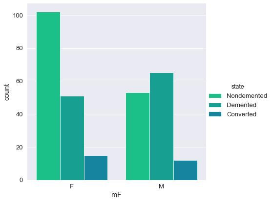
In this study, Dementia cases are more prevelant in males. There are more cases of dementia than any other state in the male group.
Distribution of variables⌗
A count plot is used to display the number of distinct values per column (similar to a histogram).
The custom q function - countPlot - takes two features and graphically generates two bar charts of the said features aligned on the same axis.
The splitList function will split a list x into y lists of even length (or close):
q)countPlot[train_copy;;] ./: splitList[`age`ses`mmse`cdr`educ`visit;3]
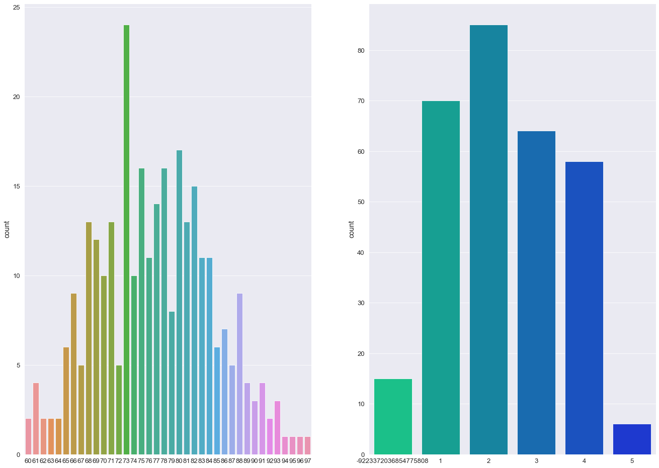
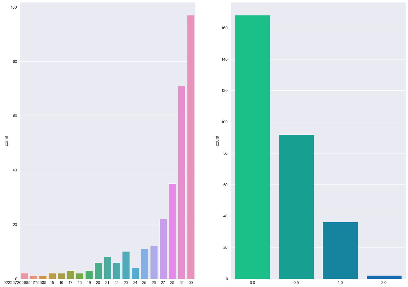
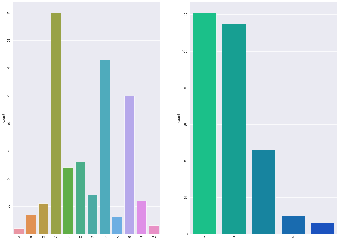
💡
- The majority of individuals in this study are aged between 70 - 85
- More than 50% of individuals received a CDR rating of 0 (>200 Subject IDs) while less than 10 subjects were diagnosed with a 2.0 CDR score.
- The most frequent socio-economic-status score in this study was 2.0 with over > 100 subject IDs (103).
- Over 60% of the study group had undertook 12+ years of Education.
- The majority of Subject IDs scored highly in their MMSE examinations (> 50% scoring 29 or above).
- The percentage ratio between females and males was 57:43.
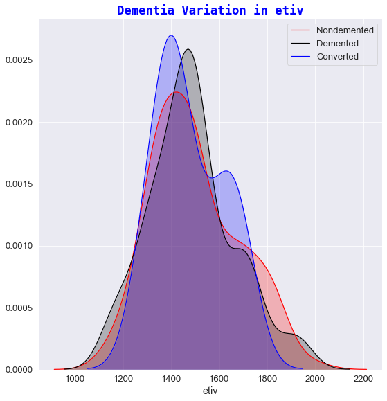
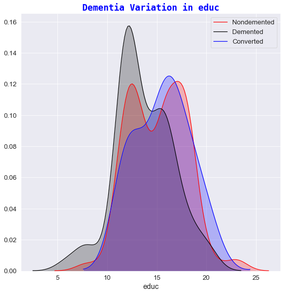
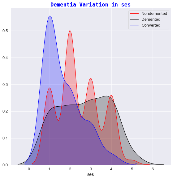
Variation of Alzheimers⌗
The next stage of data visualization involves plotting FacetGrid charts to view the relationship of the target state group against a range of different features:
- mmse
- ses
- nwbv
- etiv
- educ
- age
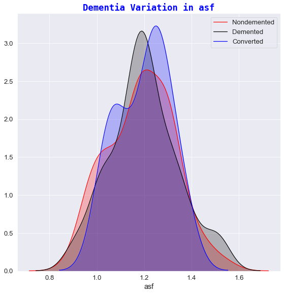
q)facetGrid[train_copy;`state;"Dementia Variation in ";] each `etiv`educ`ses`nwbv`mmse`asf;
💡
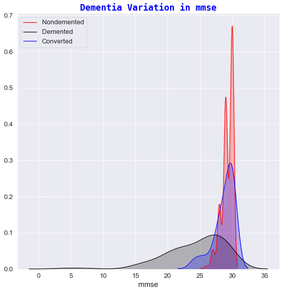
1️⃣ Dementia variation against mmse
- For high mmse scores (
mmse>29),in approximately 70% & 55% of cases respectively, the subjectIDs are generally considered asnondemented. - For low mmse scores (
mmse<22) all subjects receive adementeddiagnosis. This makes sense given that:- a
mmse<12score indicates severe dementia. - a
mmse in 13-20score suggests moderate dementia. - a
mmse in 20-24score suggests mild symptoms of Dementia[8].
- a
- There are some mmse scores (
mmse=27) that have been diagnosed asdementedwhich indicates that mmse score is not a certain indicator of Dementia symptoms.
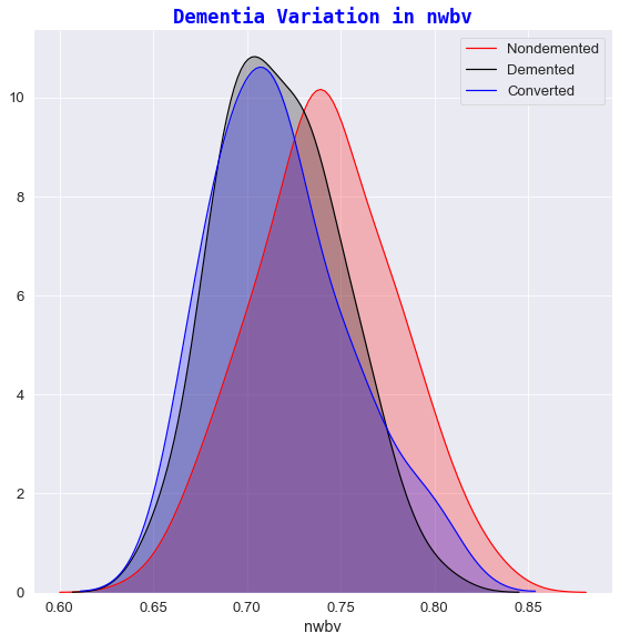
2️⃣ Dementia variation against nwbv
- Subjects who exhibited a greater percentage of normalized whole brain volume, had a greater chance of receiving a
nondementeddiagnosis. - The lower the nWBV value, the higher the possibility of a patient being classified as
dementedorconverted. In recent years, brain shrinkage has become a potential important marker for early changes in the brain tissue where such symptoms have been associated as early markers for ailments of Alzheimer’s [9].
3️⃣ Dementia variation against etiv
- The estimated total intracranial volume didn’t vary much over time and therefore etiv was not significantly different between any of classification groups.
- As referenced in the paper “Inracranial Volume and Alzheimer Disease: Evidence agaisnt the cerebal Reserve Hypothesis” by Jenkins et al 8, the Mean TIV (total intracranial volume) did not differ significantly between subjects and that the only significant predictor of TIV was sex. Thus, it was concluded that their findings do not suggest a larger brain provides better ‘protection’ against AD 8. This explains the visual cues seen in the “Dementia variation in etiv” plot i.e. ‘Demented’ and ‘Nondemented’ subjects share relatively the same etiv values.
4️⃣ Dementia variation against educ
- It seems that Dementia is more prevalent in subjects who had fewer years in Education.
- For e.g. any subject who has participated in less than 13 years of Education had a slightly increased possibility of developing Dementia whereas the chances of having Dementia-like symptoms (on first visit) decreases quite sharply for subjects who have experienced 17+ years of Education.
5️⃣ Dementia variation against age
- Dementia is more prevalent in subjects who fall within the
65-85year group. - Before 65, one could hypothesise that the subject is too young for the full blown effects of Dementia to manifest.
- After 85, given that a patient could have been living with the disease for many years, certain symptoms could have had a profound effect on an individual’s mortality.
If you survived and read to the very end 🥵 …
- Take a break
- Get a ☕
- And when you’re ready … proceed to part 2️⃣ where we delve into the world of data preprocessing